The content was there. Finding it was the problem.
McGraw Hill's Open Learning Platform powered K-12 instructional content for teachers and students, but the way that content was structured made it difficult to navigate in practice. Teachers had to drill through multiple layers just to find a single resource, and that friction disrupted the classroom moment when speed mattered most.
With major state adoptions on the horizon, the issue carried more weight than usability alone. It affected how the platform was evaluated, how content was experienced, and whether the product felt viable at scale.
The hierarchy made simple tasks feel harder than they should have.
The platform's content model was deeply nested, with multiple layers that could each hold content or simply act as containers. In practice, that meant teachers often had to click through several levels before reaching anything usable.
That structure slowed people down, broke their flow, and made content discovery feel heavier than it needed to be. For administrators reviewing the platform at a state level, it also made it harder to understand what was actually inside the curriculum.
Teachers needed to move quickly. Reviewers needed to see the whole picture.
The problem wasn't the same for every user. Teachers often knew exactly what they were trying to find and needed to get there fast. Reviewers were looking for the opposite: a high-level view that made the breadth and structure of the curriculum easier to understand.
The work had to support both experiences at once, without making either one feel compromised.
The existing navigation asked for too much effort up front.
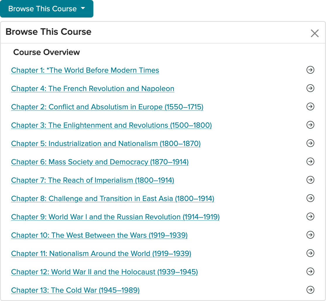
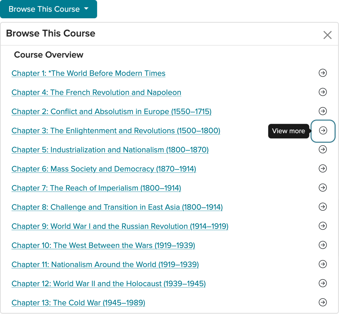
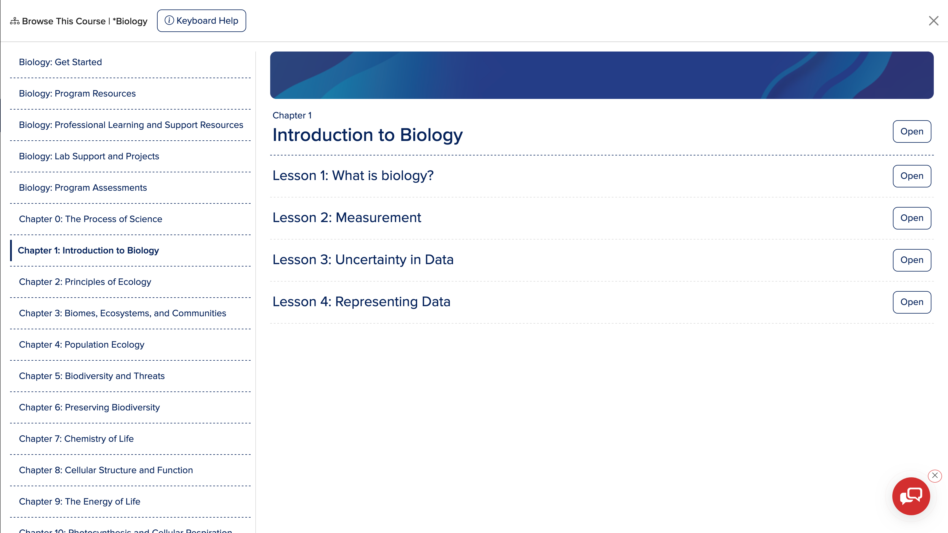
To access the course structure, teachers first had to open a separate “Browse This Course” view, then decide whether to enter a container or expand it, then continue drilling down until something actionable appeared.
That step-by-step model created unnecessary friction, especially during live instruction when teachers needed quick access and very little interruption. The deeper the structure went, the more work it took just to understand where useful content actually lived.
Too many clicks were spent uncovering structure instead of accessing content.
The hierarchy wasn't just complex. It was hidden. Users had to progressively unpack the platform before they could decide where to go next, which made navigation feel slow, opaque, and difficult to scan.
That made even well-organized content feel harder to use than it actually was.
Step One
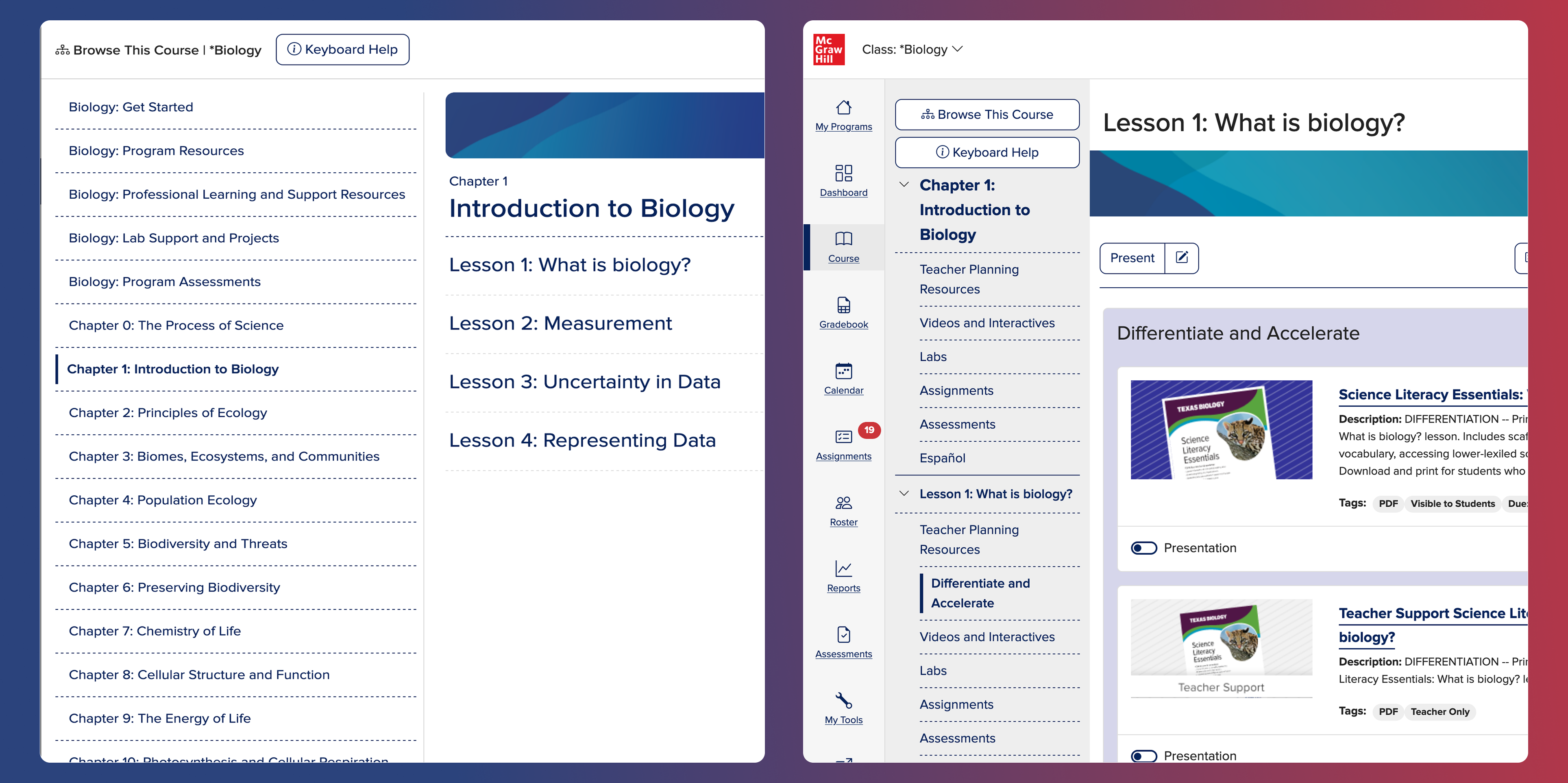
Within the product, to access the tree hierarchy of the course, teachers had to first click "Browse This Course" to expose the content structure.
Step Two
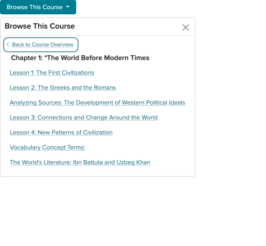
Teacher can select a direct hyperlink to to that content container, or the arrow to view what is within that specific folder.
Step Three
Once inside the parent folder the teacher can now see what is contained within that specific grouping.
The answer was
to make the structure visible.
The redesign focused on making navigation more transparent, more persistent, and easier to scan at a glance. Instead of forcing users in and out of containers, the experience was restructured to keep the course hierarchy in view and make movement through it feel more direct.
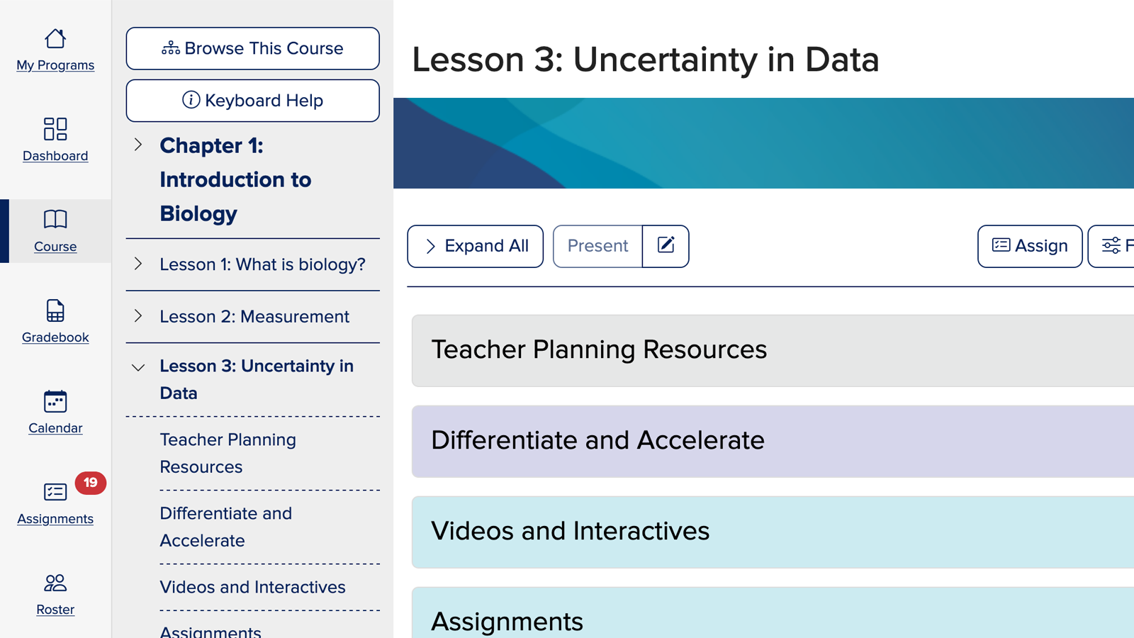
A persistent left-hand navigation panel gave teachers immediate access to course content without losing their place, while a full-page table of contents created a higher-level view for broader scanning and faster orientation.

Content Discovery
Lesson subject matter is easily viewed without unnecessarily jumping in and out of content containers.

35,000 foot view
Administrators at the state level can, within one screen, see all the educational content in context.
The goal wasn't to flatten complexity. It was to make it navigable.
The content still needed to support a wide range of educational structures, products, and roles. The work wasn't about oversimplifying that system. It was about making it easier for people to understand where they were, what was available, and how to move through it with less friction.
That shift made the platform feel more responsive to real classroom use and more legible to people evaluating it from a distance.
Making content easier to discover changed how the platform was experienced.
With the updated navigation in place, teachers no longer had to drill through intermediate containers to reach instructional materials. Content became more visible, more actionable, and easier to access in the moment.
The full-screen table of contents also gave administrators and reviewers a clearer view of the curriculum in context, helping them understand the structure and scope of the product more quickly.
Better navigation made the product easier to use in the moments that mattered most.
The new structure reduced unnecessary friction, supported more responsive classroom instruction, and helped preserve teacher flow when they needed to pivot quickly.
It also helped the platform hold up in higher-stakes evaluation settings, where discoverability, accessibility, and clarity directly influenced adoption decisions.
Reduced Unnecessary Friction
Teachers no longer needed to drill through intermediate containers; content hierarchy and materials became actionable at a glance.
Navigation at your fingertips
The persistent navigation panel and full-screen TOC replaced several click-heavy interactions with snappier, context-aware access.
Critical Content exposed
These outcomes supported more confident, responsive classroom instruction, helping educators maintain flow even when needing to pivot to new content mid-lesson.
Evergreen Access to Content
Regardless of the teacher's location, the TOC is readily available via the "Browse This Course" action button present on all content pages.
Full-page Table of Contents
Product content discoverability has been optimized for teachers, enabling quick, intuitive navigation both within and beyond the current lesson flow by removing any distractions not directly related to browsing experience.
Course Navigation Panel
Teachers no longer needed to drill through intermediate containers; content hierarchy and materials became actionable at a glance.
In products like this, friction doesn't always come from features. Sometimes it comes from how hard the structure is to see.
Making the content easier to discover didn't change what the platform offered. It changed how usable that value felt in practice. That difference is what made the experience hold up for teachers, reviewers, and the business behind it.